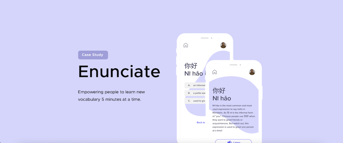
Introduction 📖
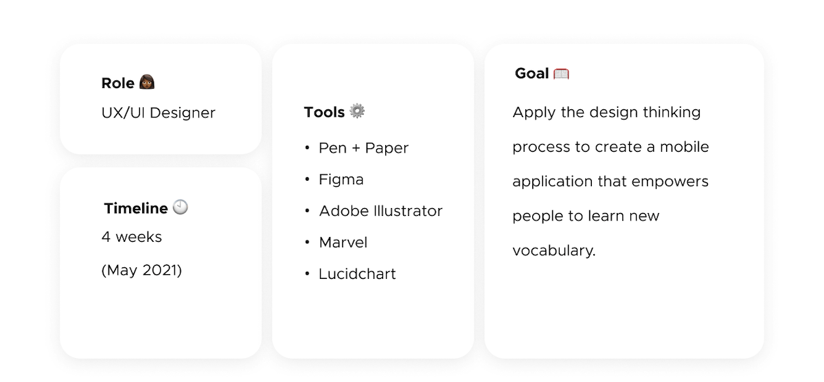
The pandemic left many of us at home with time on our hands. Many young people used it to pick up new skills like learning a new language. The problem with this, however, is as COVID numbers are dropping, and businesses and schools are reopening, many are losing motivation because they don't have the same copious amount of time to dedicate to study. I aimed to design an app to empower young people to learn new vocabulary by incorporating short lessons into their daily schedules.
The Problem 🛠
According to a report by Duolingo, a language learning website and mobile application, 30 million people attempted to learn a new language in 2020, a number 67% higher than the preceding year. Much of the spike can be attributed to the COVID-19 pandemic which implemented lockdowns in several countries. A closer look at the statistics by age reveals 40% of new learners were Gen Z (1997-2021). 27.9% of new learners reported learning for school, 19.9% were learning for travel, and 12.7% were learning to stay connected with others during the lockdown. With globalization turning the world into a global village, speaking a shared tongue presents several opportunities. A report by The Guardian showed that while young people may initially have the drive to learn new languages, reasons like time constraints, difficulty learning grammar, lack of access to native speakers, and a lack of confidence/continued motivation were cited as the main reasons for young people putting off language learning. These are problems that require solutions.

Overview ⚙️
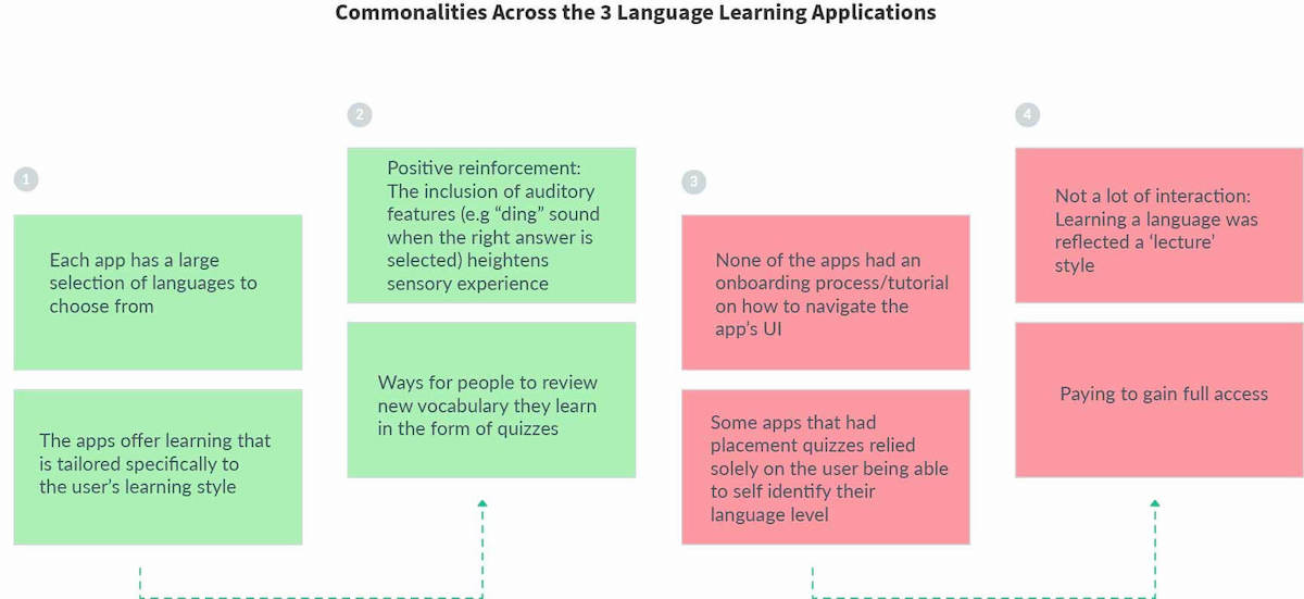
Competitor Analysis 🔎
Before figuring out who my target audience was and how to design solutions for them, I took a look at some of the existing solutions, i.e. Rosetta Stone, Babbel+, and Busuu, three language learning mobile applications, and performed an informal competitor analysis.
User Interviews 🔎
After gaining some insight into existing solutions, I conducted 5 semi-structured user interviews with young people, between the ages of 18 and 25, who were interested in/already learning a new language. This
enabled me to gain a better understanding of the problem space through qualitative insight. Observing the emotions and thought processes of the people I was designing a solution for, allowed me to reframe the
problem within the context of actual humans instead of drafting fictional problems. I focused on engaging with my target audience early which allowed me to test my assumptions about them and subsequently draft my
hypothesis and problem statements.
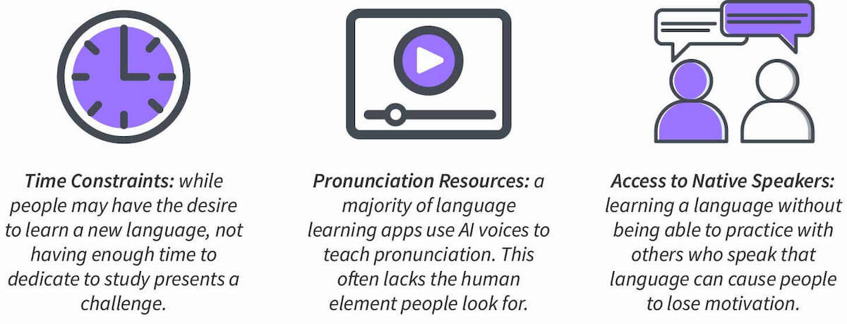
Interview Insights:
Three clear patterns emerged within the participants' responses:
User Persona 🔎
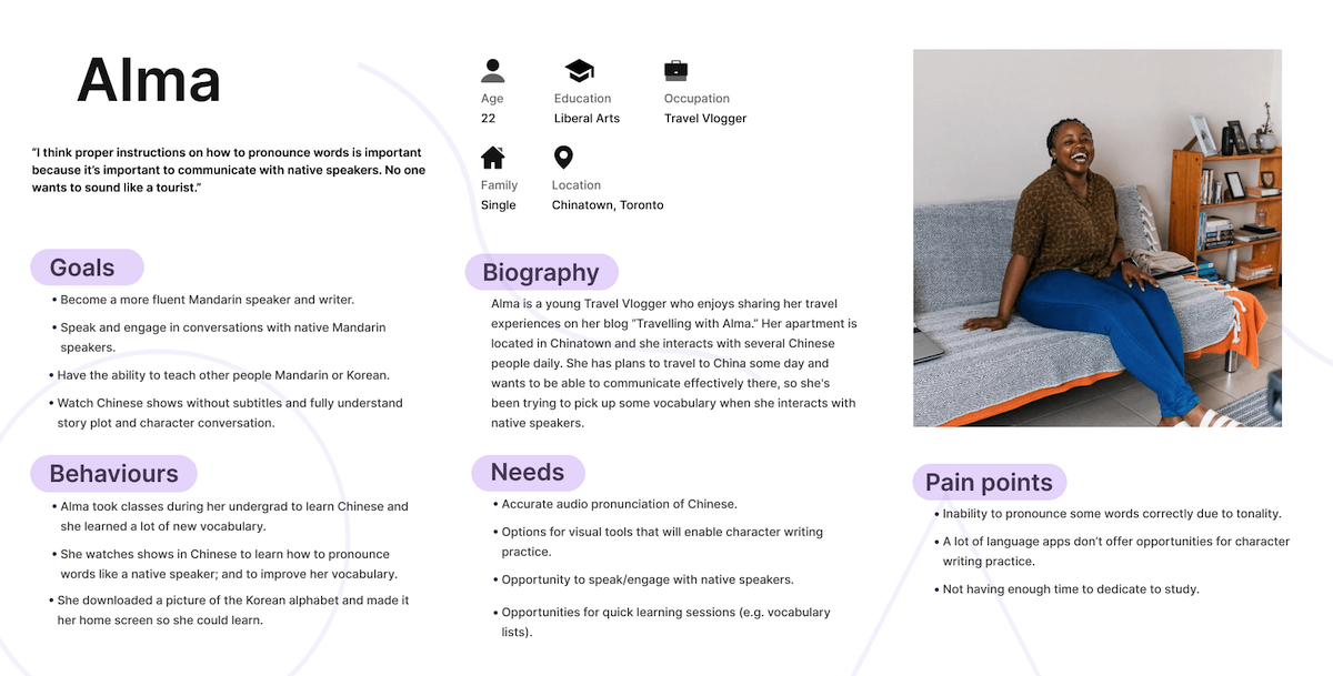
Once I had a good understanding of the responses I created Alma, a persona based on qualitative data from the interviews. Creating and implementing a design solution with a tangible persona in mind added a necessary human element to the design process by ensuring her needs and experiences were put first. It also presented something to constantly refer to and refine during the evaluative process as my target audience interacted with Enunciate, allowing me to keep her user experience in mind.
User Journey 🔎
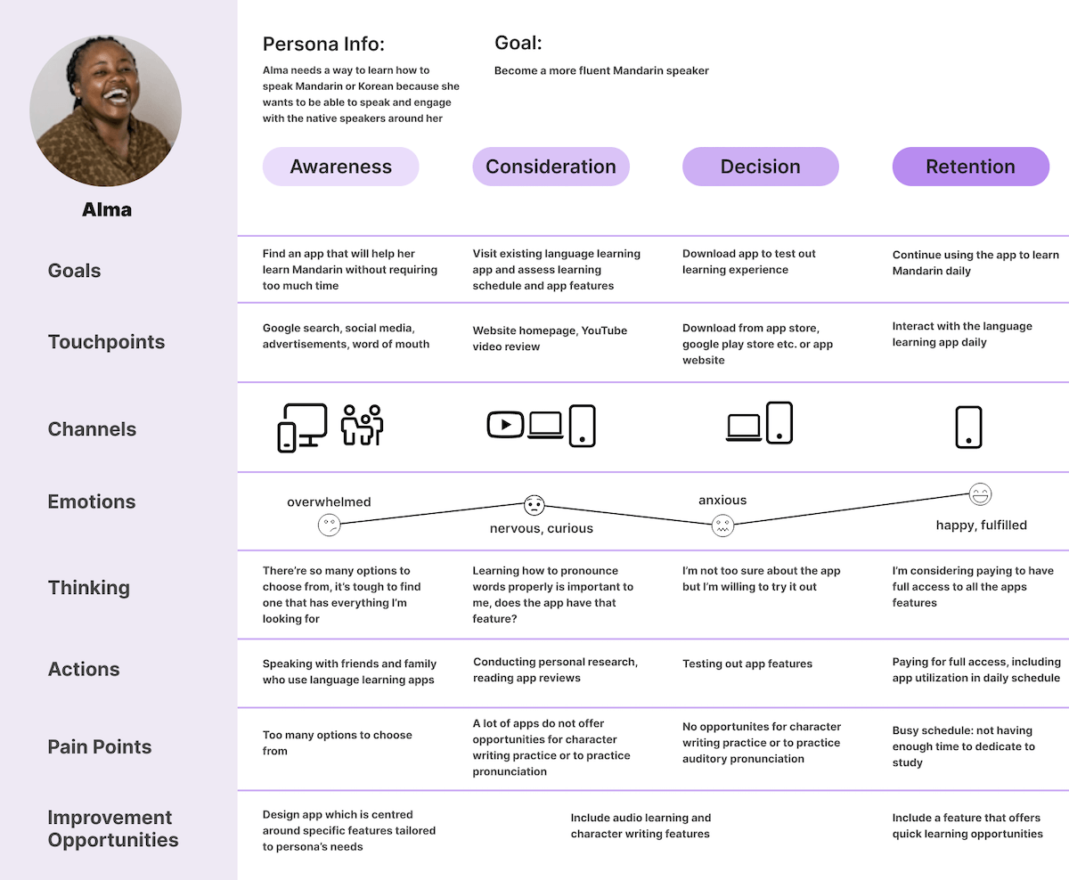
Visualizing Alma's Experience Once I had established Alma's persona, I created an experience map to visualize what her process to accomplish her goal of becoming a more fluent Mandarin speaker
looked like.
User & Job Stories 🔎
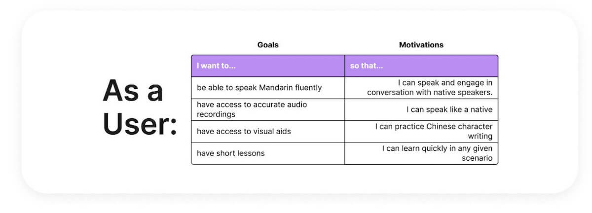
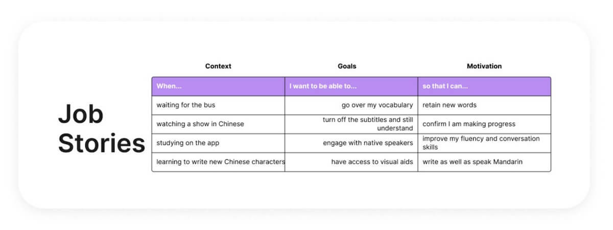
Understanding Alma's goals, pain points, behaviours, as well as visualizing her user experience journey allowed me to focus on defining functions and solutions from her specific perspective. Based on the responses from the interviews, I wrote four user stories and job stories that focus on what Alma wants to accomplish and in possible contexts. As noted above three main concerns were relative to time constraints, access to accurate audio pronunciation, and access to native speakers.
Problem & Hypothesis Statements 🔎
With this information, I had a good understanding of the problem at hand, so I drafted a set of problem and hypothesis statements to keep the project focused on a specific problem I was designing a solution
for.
Problem Statement
Alma needs a way to learn how to speak Mandarin, that doesn't require too much time commitment, because she wants to be able to communicate and engage with the native speakers around her. We will know this to
be true when Alma continuously uses the app to learn new vocabulary/phrases over time.
Hypothesis Statement
I believe that by including the following features: short study sessions, audio learning, visual aids (e.g. vocabulary lists), and community tools to engage and connect with native speakers and other
learners, I will achieve the goal of enabling Alma to attain her goal of speaking like a native.
Task Analyses 🔎
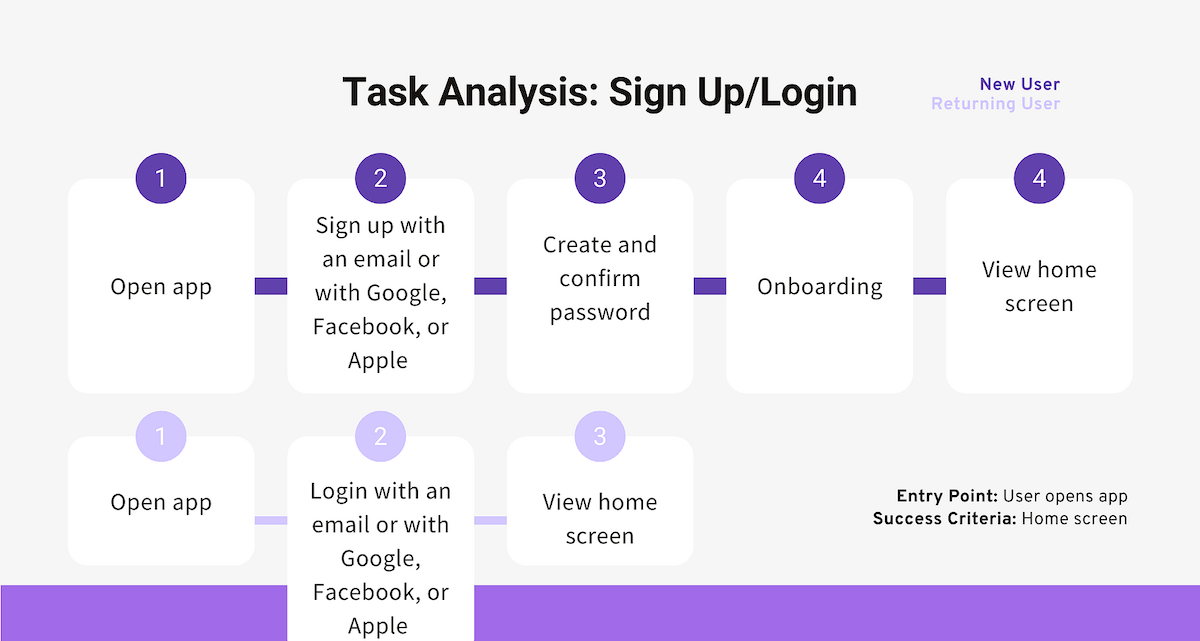
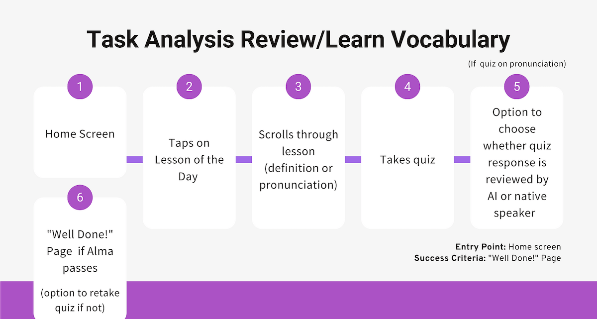
After pinpointing a primary problem, and drafting a hypothesis, it was time to focus on designing a solution. I honed in on two crucial tasks Alma would have to complete to achieve her goal of becoming more
fluent in Mandarin; creating or signing into an account to track her progress (and seamlessly switch between devices), and a way to learn or review new vocabulary.The task analyses below outline the common
steps required to perform and complete each task.
Task 1: Sign up/Login
Task 2: Learn/Review Vocabulary
User Flows 🔎
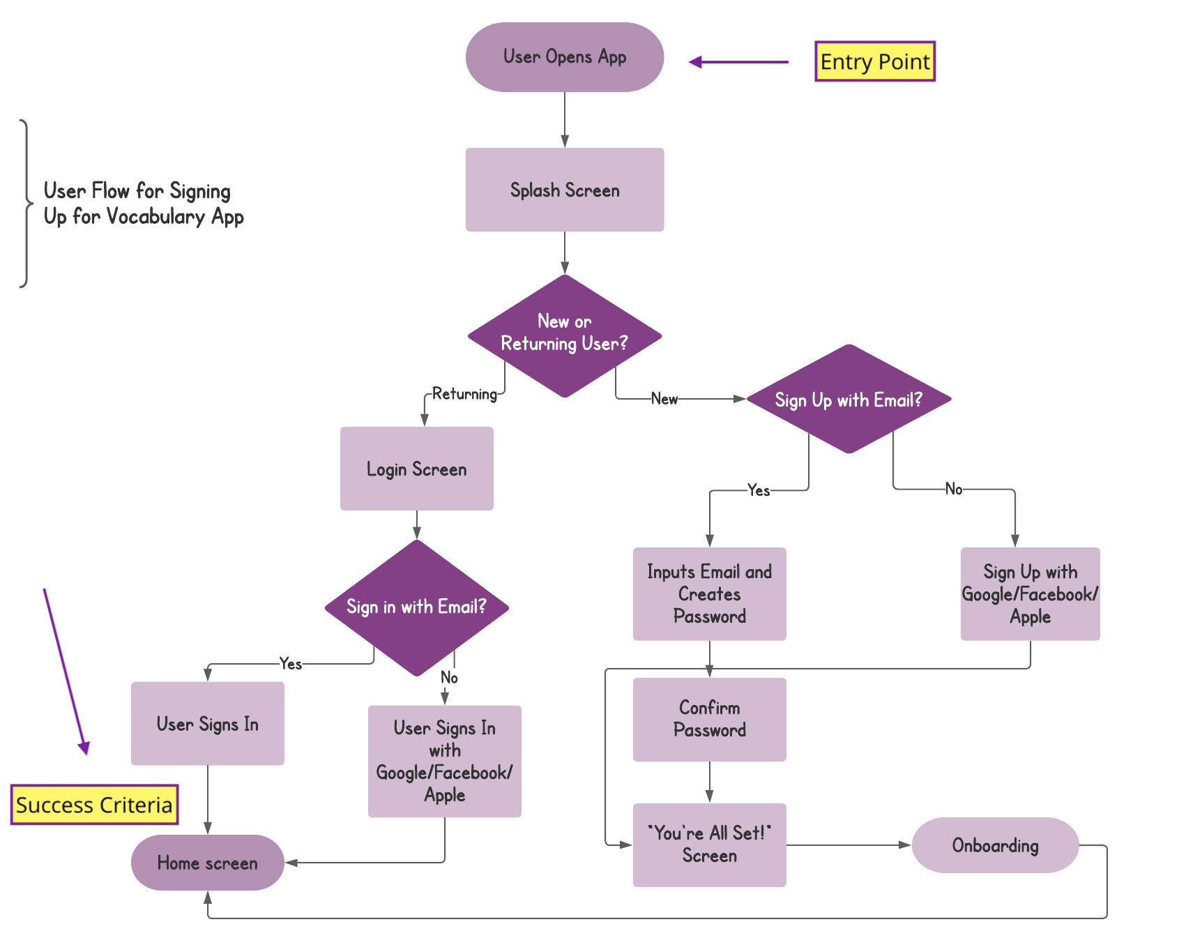
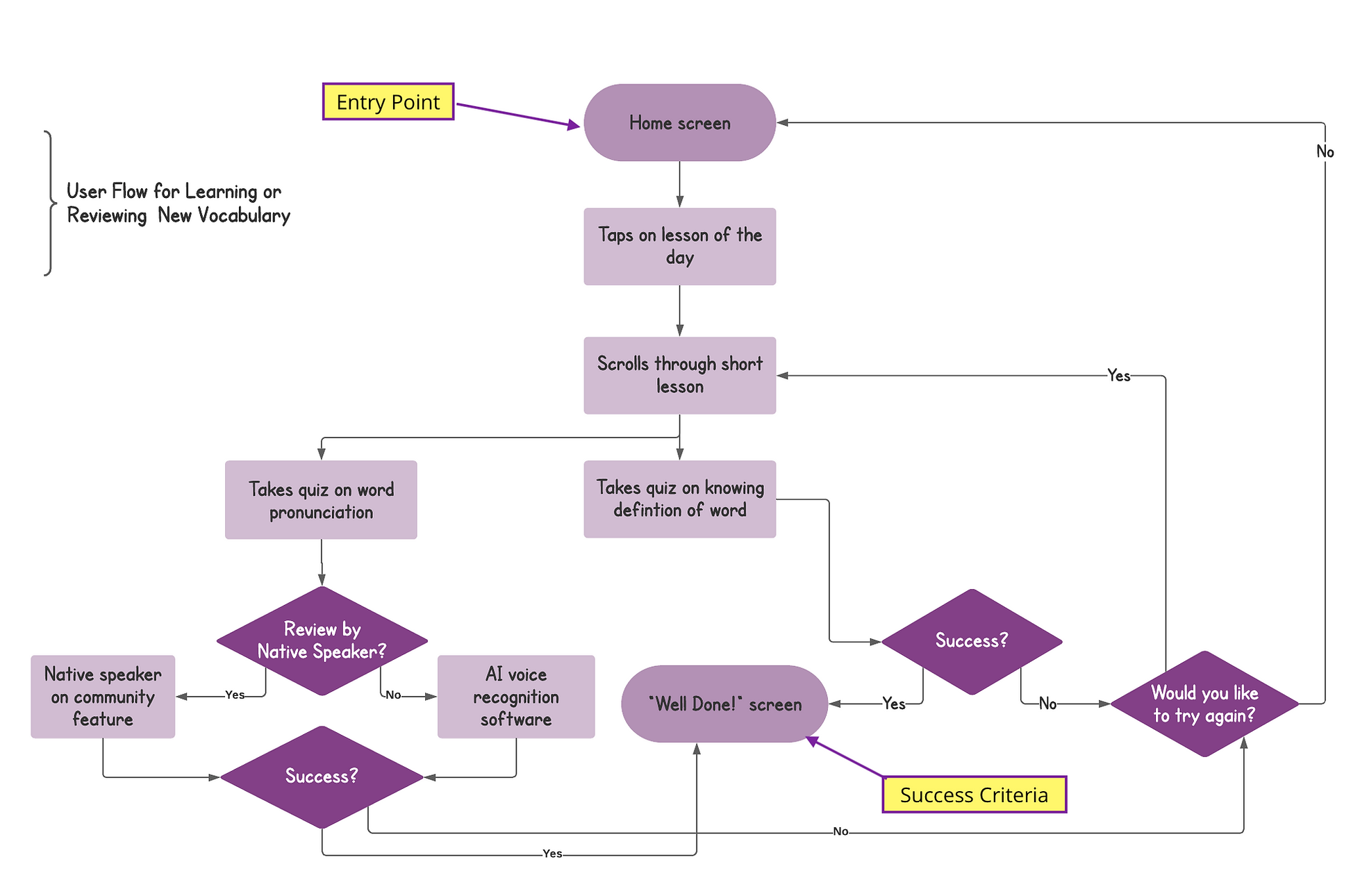
Based on the task analyses above, I could set out the path Alma would follow as she navigated through the app's interface to achieve her goals. Whereas the task analyses focus specifically on the task, user flows emphasize the type of user performing the task, which in this case is Alma.
Sketches, Wireframes, & Prototypes 🔎
From there, I was able to iterate low-fidelity wireframes to begin the evaluation process of assessing whether I had not only helped Alma achieve her goal but also created an enjoyable experience for her. I
started the design process off with pen and paper sketches which allowed me to iterate through many design options quickly. I then turned those sketches into a prototype which I could then test.
(Tap/click the screen to engage with the prototype) or click here to view it in your
browser.
Usability Testing🔎
As the prototype was in its early stage, I remotely conducted moderated usability testing to reveal possible usability problems Alma might encounter as she used the app, as well as how she naturally
interacted with the product. I used
Jakob Nielsen's Error Severity Rating Scale as a guide to distinguish between the error severity levels.
Moderated testing was the best option as the prototype was in the early stages and missing certain functionalities, so the users required guidance to complete the desired tasks.
Nuts & Bolts
Scope:
I set out to test the usefulness (usability + utility) of the following features: navigation, learning (Lesson of the Day), onboarding, sign up/login, and community as I believed these to be key to the app's
utility and would effectively address Alma's concerns.
Schedule:
Due to the pandemic, I met independently with three participants within my target audience via video call software. Each moderated session lasted 10-15 minutes on average.
Equipment:
I decided to test on solely iOS devices due to time constraints and the convenience of participants.
Metrics: Jakob Nielson's Error Severity Rating Scale.
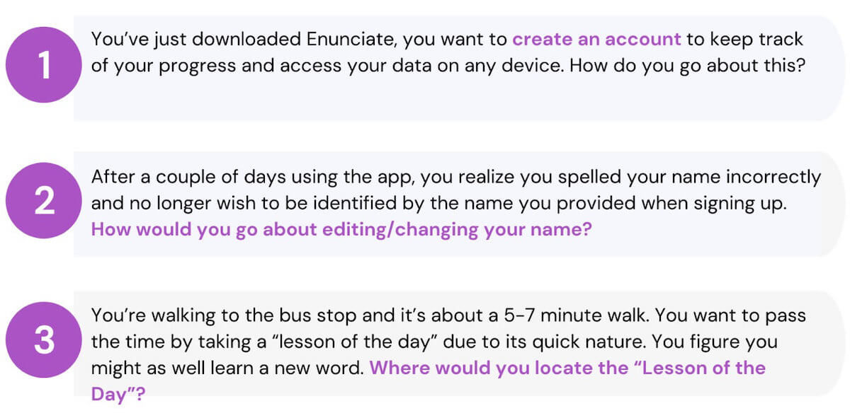
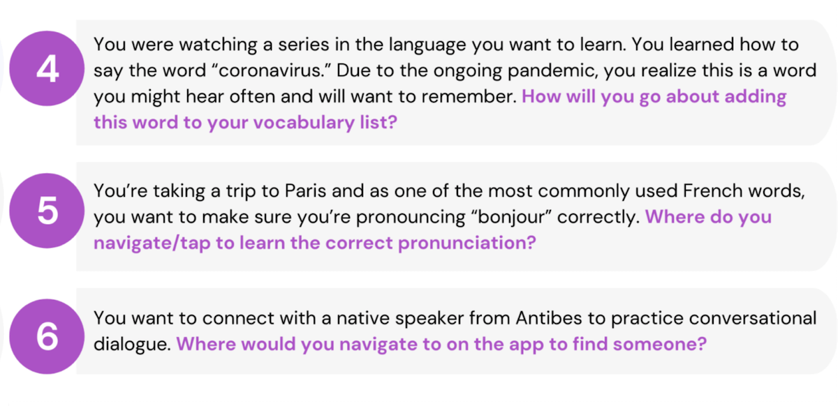
10 a. Direct & Scenario Tasks
With both primary tasks in mind, I set up 6 direct tasks, and 6 scenario tasks to evaluate the prototype's usability.
10 b. Usability Test Insights
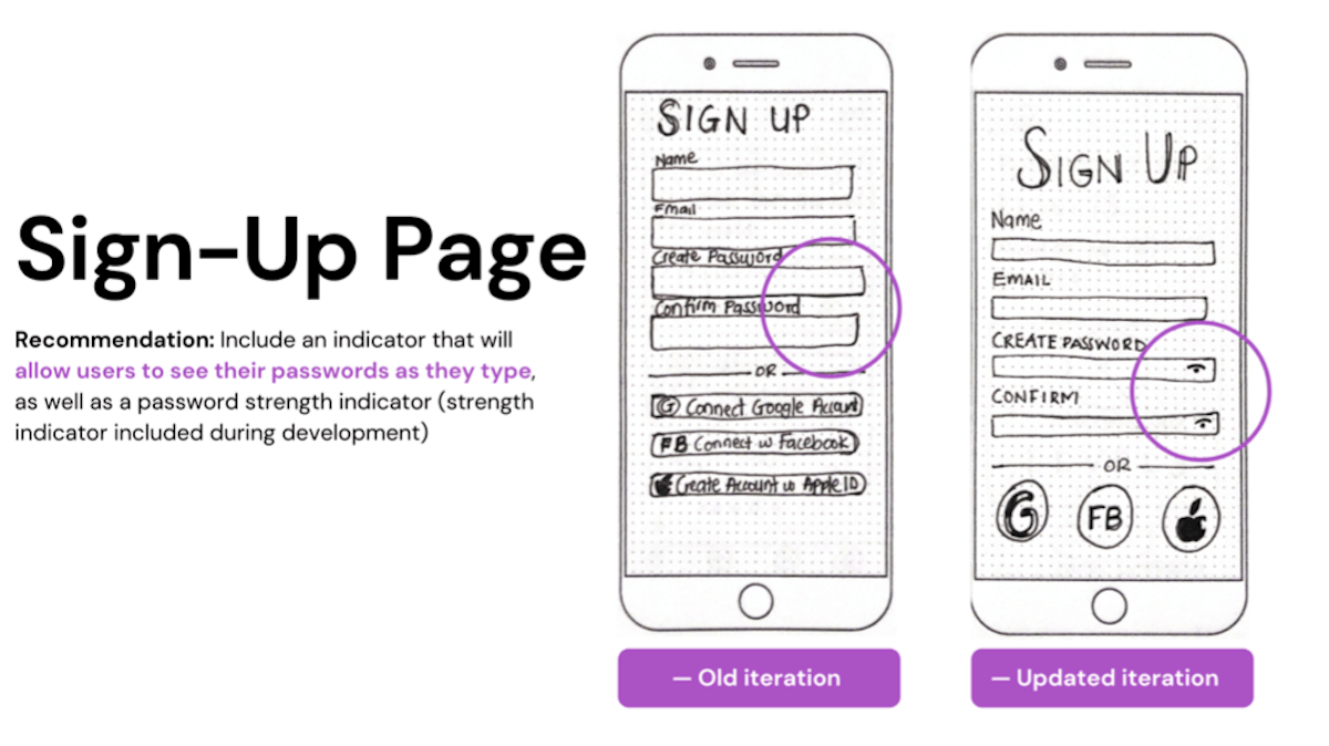
One thing I noticed during the testing was that the onboarding process was necessary to help with navigation retention rates. While this did improve the app's usability, there were still other identified
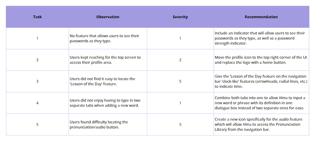
errors. The results of the tests were summarized into 5 points according to their place on the Error Severity Rating Scale as well as with recommendations for improvements.
- 0 = I don't agree that this is a usability problem at all
- 1 = Cosmetic problem only: need not be fixed unless extra time is available on the project
- 2 = Minor usability problem: fixing this should be given low priority
- 3 = Major usability problem: important to fix, so should be given high priority
- 4 = Usability catastrophe: imperative to fix this before the product can be released
10 c. Prototype Updates
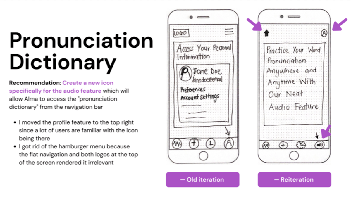
As seen in the image above, the features that were supposed to allow Alma to review and learn vocabulary (Lesson of the Day and Audio) were not as easy to locate from the app's flat navigation as I had
thought. Additionally, it wasn't easy getting back to the home screen once Alma navigated to a different page. I had been placing too much focus on the app's features that I had forgotten to include
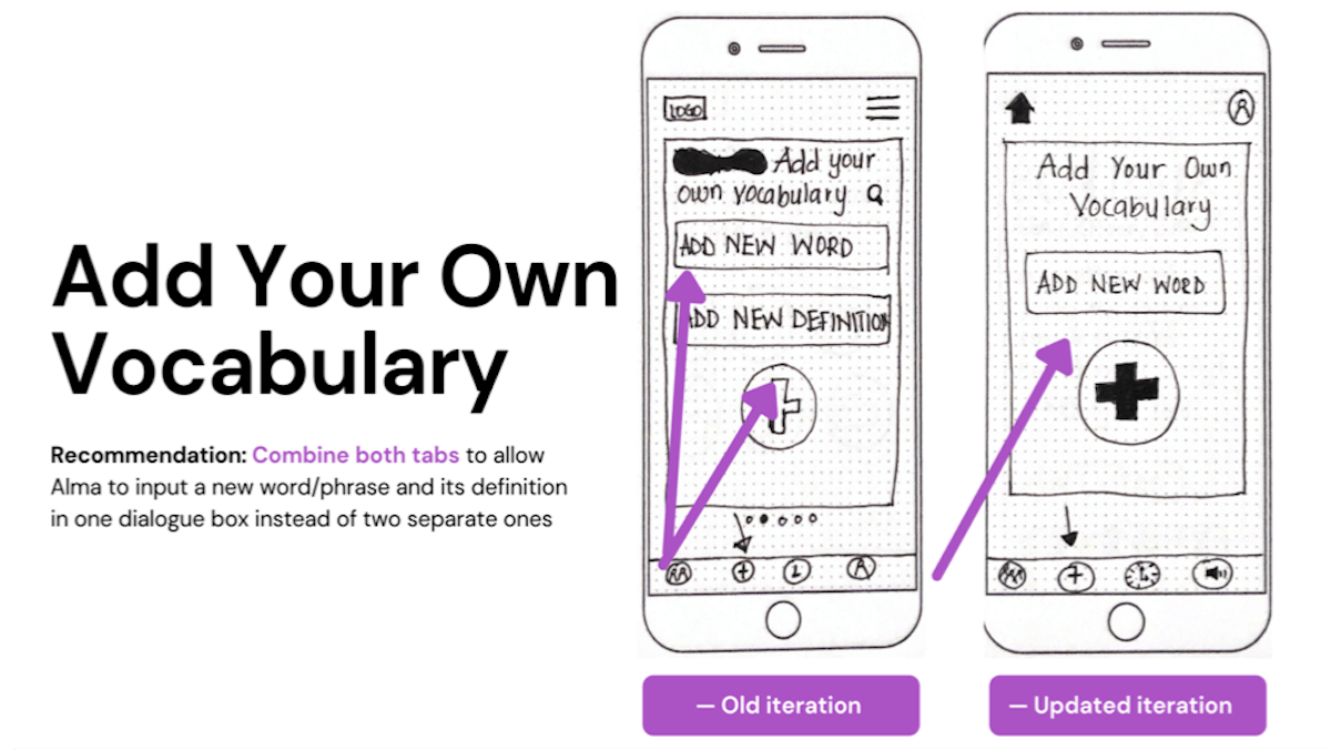
simple things like a home button in the app's information architecture. This meant going back to the drawing board, as any good designer would.Additionally, since accurate pronunciation was one of Alma's
main concerns, I felt adding a separate section for access to a dictionary with audio features for improving enunciation might be more useful to Alma in achieving her goals.
After these changes, I conducted another round of testing, and users were able to navigate through the app much quicker and complete the tasks much faster.Ideally, I would have preferred to conduct
several rounds of testing after each reiteration, but due to time constraints, I was only able to conduct two rounds. Nevertheless, the insights from the usability testing allowed me to go back and create
more iterations and reiterations to make the app more usable and useful for the user which is most important
UI Design 🔎
A UX designer once said, "designs are never final, but cycles end" (Funmilade Taiwo).
In designing the final high fidelity mockups, I wanted to create a brand identity that was reflective of the users-- youthful, creative, and curious, so I went with a fresh and light visual style. As I was
designing for iOS screens, I followed Apple's iOS Human Interface Guidelines to ensure Enunciate's design was seamlessly integrated with Apple devices. Overall, I wanted the app to be intuitive, easy to
navigate, easy to use, and content-focused. Based on the feedback I received from the second usability test it was, and most importantly the app's features were essential in helping Alma achieve her goals.
For your own experience with Enunciate, feel free to engage with the prototype below or
click here
to view it in your browser.
Lessons Learned 🔎
Understanding the design thinking process as cyclical helped a lot because I could go back to previous stages without feeling like I was "falling behind" in the process. For instance, I could design sketches, test out the lo-fi prototype, and go back to the research stage to collect more qualitative data on my target audience which ultimately helped enrich the overall experience for myself and the user. As this is the first UX design project I have ever undertaken, I can say I'm proud of how it turned out. It's not perfect (there's always more to learn, improve and reiterate), but it was a great learning experience and a good starting point, and I'm looking forward to doing it all over again (right after a Netflix break).
